Typography is everywhere. Not only on the internet, but also on billboards, movie captions, books, magazines, and any material that uses text to convey information. Since this article is centered around web design, that is the perspective of typography that it will cover. Yet, know that the concepts in this article can be extended to include almost any form of text. Let’s start with fonts.
Font family
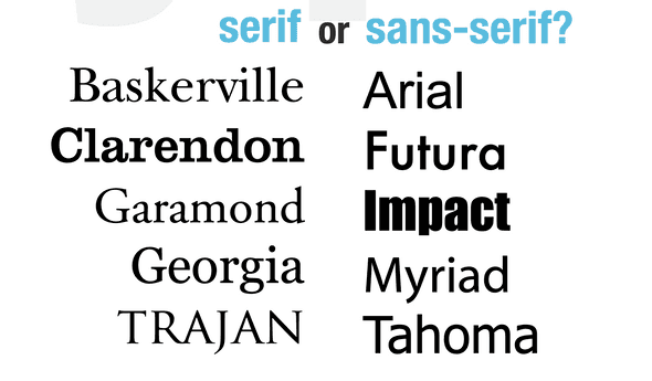
Fonts can generally be broken up into two kinds: serif or sans-serif. Serif fonts have decorative strokes at the end of most letters (these strokes are also called serifs). Below is an image comparing serif vs sans-serif fonts.
The debate between serif fonts and sans-serif fonts is likely as old as typography itself. In general, serif fonts provide a classic, ornate, and readable look on paper and physical mediums. Meanwhile, sans-serif fonts give the impression of a modern, sleek and minimalist design. Although it is unusual, it’s possible to mix and match a serif font with a sans-serif one. When doing this, it’s recommended to use sans-serif for titles and serif for the body text.
Rule of thumb: No more than two font families per page
When deciding on typography, try to stick to one font family for your website, but no more than two that match well with each other. This provides a consistent look and feel for your web design. It also helps boost brand awareness. When choosing fonts, pick similar-looking pairs that match each other, preferably font pairings that are recommended by a professional font designer or copywriter. One of the best resources for browsing free fonts and installing them on any web page is Google Fonts. Each font has a “pairings” tab that shows the fonts that go well with it, a great start for picking font pairs!
Font size and other properties
Although picking font families is the first and one of the most important steps in shaping your design, typography doesn’t stop there. It’s also important to test the font size on different screens to ensure readability across all web design elements. This makes your design more accessible and approachable.
While pixel units were the de-facto way of sizing fonts and other elements with CSS, we now have a more approachable way of sizing fonts for different devices that users use today: relative units like rem. These relative units adjust to the user’s browser settings and device settings, adjusting the size of the text dynamically to keep it readable. Another property that is useful for enhancing readability is the line-height property, which controls line spacing. line-height can be a unitless or percentage-based value to control line spacing (ex: 200% would be double spaced. So would a value of 2.0).
Like the line-height property, there are a few other properties that can be fine-tuned to give your text the unique look it deserves. One of these is the font-weight property, which is useful for controlling boldness or lightness. Note that not all font families support fine-tuning the font-weight property. However, it’s useful because almost all header tags by default look too bold. It can be a helpful design decision to tone down the font-weight of heading tags. Font weight can be combined with the <em> tag to give an italicized look. It can also be combined with the property text-decoration: underline; to underline the custom weight text.
Last but not least, there is the alignment of the entire document. The text-align property can be added to almost any element with text in it to change the alignment of text left, right, or center. However, a personal favorite is combining the text-align: justify; property with a way to even out word spacing with the properties word-break: break-all; and hyphens: auto;. This gives your written content a newspaper-like feel for enhanced readability and accessibility.
Design typography holistically
The typography you pick for a designed product should fit with the overall color scheme and brand. This applies when considering both physical and digital products. Font placement for web products should be different from font placements for a physical product like a can of soup. Pick font families and sizes according to the context that they are designed for. Like any good design, the form should follow the function.
